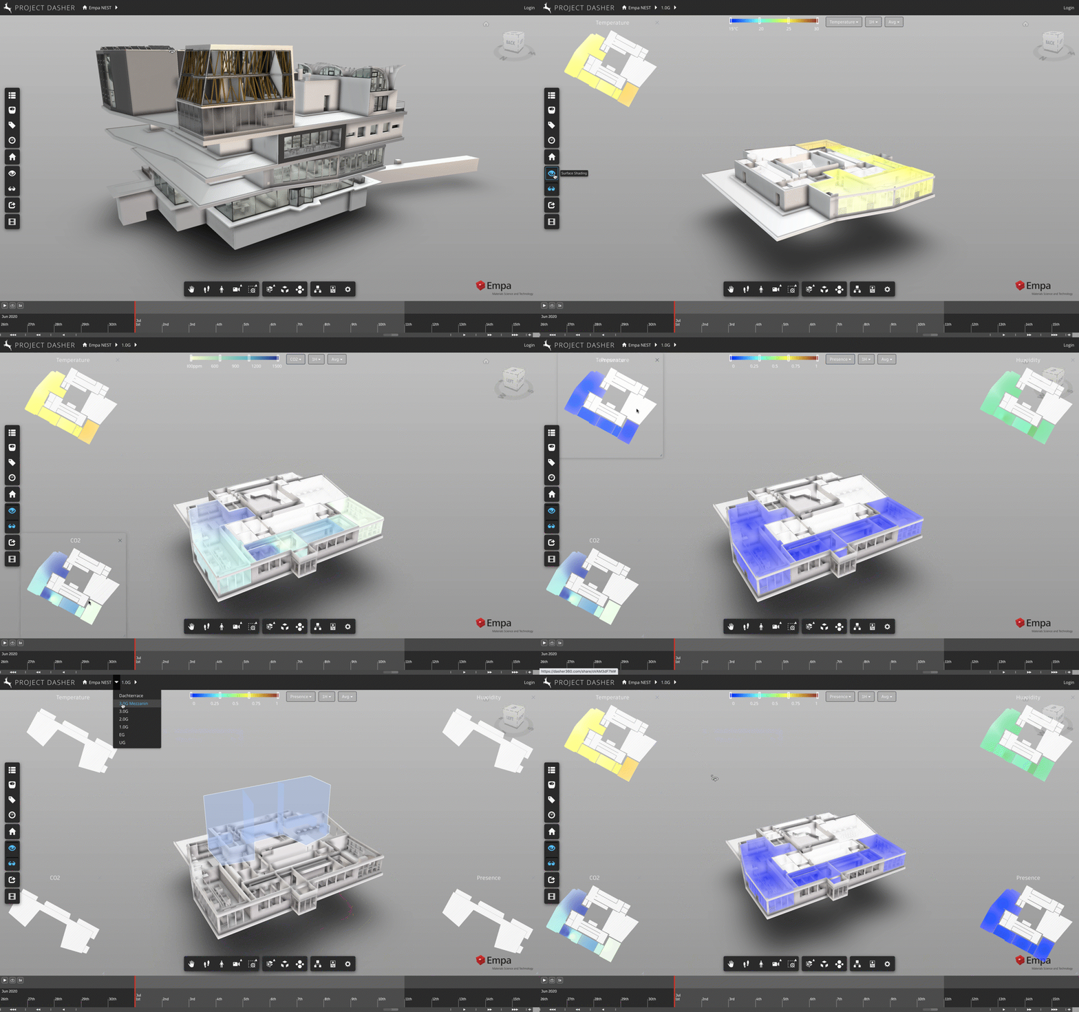
In the last couple of posts in this series, we looked at how we’ve been able to include a 2D heatmap view inside Project Dasher and make it resizable via a square, transparent panel.
This post is really just to let you know that we’ve now extended the capability to support multiple heatmaps, which is particularly interesting if you want to compare data from different sensor types across the floor of a building. (I often say that the value in a tool like Dasher is in its ability to correlate multiple streams of data – such as occupancy with CO2 – so this is certainly a tool that I see being used for diagnosing complex scenarios.)
Here’s an animation showing how to set them up. Basically as long as you have the “2D heatmaps” option turned on in the “Appearance” settings then the heatmaps will get created whenever you select an item from the sensor type dropdown. (You don’t need to change the type – it can be same as the currently selected one.)
Only one panel…


